Overview
Overview
Banners are used to introduce a page, their content should reflect the goals, content and purpose of the page they're on.
Our banners have been specifically designed to help communicate the information architecture of the website with different banners recommended for different page types.
Banners in our Design System incorporate the positioning and styling of breadcrumbs, Heading 1 text, page descriptions, call to actions, images or illustrations and range of colour options.
There are four types of standard page banners in our Design System:
- No banner
- Default banner
- Basic banner
- Advance banners
There is also an alternative layout option for banners at XL screen sizes know as the contained banner layout.
No-banner
The no banner is comprised of our breadcrumbs style located within a section container.
The no banner style is used for pages where vertical height is an important consideration. This style includes the breadcrumbs only and the rest of the banner content is placed within the content of the page.
<!--
  Default (White):  <section class="qld__banner">
  Light:            <section class="qld__banner qld__banner--light">
  Alt:              <section class="qld__banner qld__banner--alt">
  Dark:             <section class="qld__banner qld__banner--dark">
  Dark-alt:         <section class="qld__banner qld__banner--dark-alt">
-->

<!-- Alt Colour -->
<section class="qld__body qld__body--breadcrumb qld__body--alt">
    <div class="container-fluid">

        <!-- Breadcrumbs -->
        <nav class="qld__breadcrumbs" aria-label="breadcrumb">

            <!-- Desktop breadcrumbs -->
            <ol class="qld__breadcrumbs__list--desktop qld__link-list qld__link-list--inline">
                <li class="qld__breadcrumbs__item">
                    <a href="#" class="qld__breadcrumbs__link">Home</a>
                </li>
                <li class="qld__breadcrumbs__item">
                    <a href="#" class="qld__breadcrumbs__link">Components</a>
                </li>
                <li aria-current="page" class="qld__breadcrumbs__item">
                   Banner (No banner option)
                </li>
            </ol>

            <!-- Mobile breadcrumbs -->
           <div class="qld__breadcrumbs__list--tablet qld__link-list qld__link-list--inline">
                <div class="qld__breadcrumbs__item">
                    <a href="#" class="qld__breadcrumbs__link">
                        Components
                    </a>
                </div>
            </div>
            <div class="qld__breadcrumbs__list--mobile qld__link-list qld__link-list--inline">
                <div class="qld__breadcrumbs__item">
                    <a href="#" class="qld__breadcrumbs__link">
                        Banner (No banner option)
                    </a>
                </div>
            </div>
        </nav>

    </div>
</section>
Usage guidelines
When to use it
- Form pages
- Pages with only one heading
- Content and article pages
When not to use it
- Home pages
- Primary category pages
Default banner
The default banner features breadcrumbs, a <h1> page title and a background colour or background texture. This is the default banner for content pages in the Design System.
<!--
  Default (White):  <section class="qld__banner">
  Light:            <section class="qld__banner qld__banner--light">
  Alt:              <section class="qld__banner qld__banner--alt">
  Dark:             <section class="qld__banner qld__banner--dark">
  Dark-alt:         <section class="qld__banner qld__banner--dark-alt">
-->

<!-- Alt Default banner -->
<section class="qld__banner qld__banner--alt qld__banner--breadcrumbs">

    <!-- Mobile breadcrumbs -->
    <nav class="qld__breadcrumbs qld__banner__breadcrumbs qld__banner__breadcrumbs--mobile" aria-label="breadcrumb">
        <div class="qld__link-list qld__link-list--inline">
            <div class="qld__breadcrumbs__item">
                <a href="#" class="qld__breadcrumbs__link">
                    Components
                </a>
            </div>
        </div>
    </nav>

    <div class="container-fluid">
        <div class="qld__banner__content">
            <!-- Desktop breadcrumbs -->
            <nav class="qld__breadcrumbs qld__banner__breadcrumbs qld__banner__breadcrumbs--desktop" aria-label="breadcrumb">
                <ol class="qld__link-list qld__link-list--inline">
                    <li class="qld__breadcrumbs__item"><a href="#" class="qld__breadcrumbs__link">Home</a></li>
                    <li class="qld__breadcrumbs__item"><a href="#" class="qld__breadcrumbs__link">Components</a></li>
                    <li aria-current="page" class="qld__breadcrumbs__item" style="overflow: hidden;">Default banner</li>
                </ol>
            </nav>
            <!-- Page title -->
            <h1>Default banner</h1>
        </div>
    </div>

</section>
Usage guidelines
To ensure consistency, the banner displayed on each content page within the same hierarchy level should use the same background patterns or colours as other pages in that level.
When to use it
Default banners are best suited for content pages.
When not to use it
- Home pages
- Category pages
- Landings pages
Basic banner
This banner is designed for pages that benefit from a short introduction or abstract, it builds on the functionally within the default banner and adds the option for background images.
<!--
  Default (White):  <section class="qld__banner">
  Light:            <section class="qld__banner qld__banner--alt">
  Alt:              <section class="qld__banner qld__banner--alt">
  Dark:             <section class="qld__banner qld__banner--dark">
  Dark-alt:         <section class="qld__banner qld__banner--dark-alt">
-->

<style>
    .qld__banner--texture-dark {
        background-image: url(https://www.design-system.health.qld.gov.au/__data/assets/image/0016/110275/Dark-Pattern.png);
    }
    .qld__banner--background-image-alt {
        background-image: url(https://www.design-system.health.qld.gov.au/__data/assets/image/0016/110275/Dark-Pattern.png);
    }
</style>

<!-- Dark Basic banner -->
<section class="qld__banner qld__banner__basic qld__banner--dark qld__banner--breadcrumbs qld__banner--texture-dark">

    <!-- Mobile breadcrumbs -->
    <nav class="qld__breadcrumbs qld__banner__breadcrumbs qld__banner__breadcrumbs--mobile" aria-label="breadcrumb">
        <div class="qld__link-list qld__link-list--inline">
            <div class="qld__breadcrumbs__item">
                <a href="javascript:void(0)" class="qld__breadcrumbs__link">
                Parent page
                </a>
            </div>
        </div>
    </nav>

    <div class="container-fluid">
        <div class="qld__banner__wrapper">
            <div class="qld__banner__main row">
                <div class="qld__banner__content col-xs-12">

                    <!-- Desktop breadcrumbs -->
                    <nav class="qld__breadcrumbs qld__breadcrumbs--dark qld__banner__breadcrumbs qld__banner__breadcrumbs--desktop"
                        aria-label="breadcrumb">
                        <ol class="qld__breadcrumbs__list--desktop qld__link-list qld__link-list--inline">
                            <li class="qld__breadcrumbs__item">
                                <a href="javascript:void(0)" class="qld__breadcrumbs__link">Home</a>
                            </li>
                            <li class="qld__breadcrumbs__item">
                                <a href="javascript:void(0)" class="qld__breadcrumbs__link">Page 1</a>
                            </li>
                            <li class="qld__breadcrumbs__item">
                                <a href="javascript:void(0)" class="qld__breadcrumbs__link">Page 2</a>
                            </li>
                            <li class="qld__breadcrumbs__item">
                                <a href="javascript:void(0)" class="qld__breadcrumbs__link">Page 3</a>
                            </li>
                            <li class="qld__breadcrumbs__item">
                                <a href="javascript:void(0)" class="qld__breadcrumbs__link">Parent page</a>
                            </li class="qld__breadcrumbs__item">
                            <li class="qld__breadcrumbs__item" aria-current="page">
                                 Current page
                            </li>
                        </ol>
                    </nav>

                    <h1>Banner Basic</h1>
                    <div class="qld__banner__content--body qld__abstract">
                        <p>Banner basic abstract text</p>
                    </div>
                </div>
            </div>
        </div>
    </div>

</section>
Usage guidelines
When to use it
- Standard content pages, that benefit from a short introduction or abstract
- Standard content pages that require subtle graphics such as first nations pages
- Landing pages that aren't part of the primary navigation menu
When not to use it
- Home pages
- Category pages
Advanced banner
The advance banner includes all the features of the other banners in the Design System with the addition of more advanced design options.
These include:
- Icon navigation tiles
- Navigational arrow cards
- CTA buttons
- an alternative heading style and
- three hero image layouts.
The advance banners are best used for home pages and primary category pages. The advance banner on the home page is the only banner that doesn't require breadcrumbs.
<!--
  Default (White):  <section class="qld__banner">
  Light:            <section class="qld__banner qld__banner--alt">
  Alt:              <section class="qld__banner qld__banner--alt">
  Dark:             <section class="qld__banner qld__banner--dark">
  Dark-alt:         <section class="qld__banner qld__banner--dark-alt">
-->

<section class="qld__banner qld__banner__advanced qld__banner--dark qld__banner--breadcrumbs qld__banner--has-hero">

    <!-- Mobile breadcrumbs -->
    <nav class="qld__breadcrumbs qld__banner__breadcrumbs qld__banner__breadcrumbs--mobile" aria-label="breadcrumb">
        <div class="qld__link-list qld__link-list--inline">
            <div class="qld__breadcrumbs__item">
                <a href="javascript:void(0)" class="qld__breadcrumbs__link">
                Parent page
                </a>
            </div>
        </div>
    </nav>

    <div class="container-fluid">
        <div class="qld__banner__wrapper">
              <div class="qld__banner__main row">
                <!-- Banner hero image -->
                <div class="qld__banner__hero col-xs-12 col-md-6 col-lg-5">
                    <div class="qld__banner__image" role="img" aria-label="A customer smiling at his two children" style="background-image: url('https://www.design-system.health.qld.gov.au/__data/assets/image/0017/110276/Hero-placeholder-Crop.jpg');"></div>
                </div>
                <!-- Banner content -->
                <div class="qld__banner__content col-xs-12 col-md-6 col-lg-7">
                       <!-- Desktop breadcrumbs -->
                        <nav class="qld__breadcrumbs qld__breadcrumbs--dark qld__banner__breadcrumbs qld__banner__breadcrumbs--desktop"
                            aria-label="breadcrumb">
                            <ol class="qld__breadcrumbs__list--desktop qld__link-list qld__link-list--inline">
                                <li class="qld__breadcrumbs__item">
                                    <a href="javascript:void(0)" class="qld__breadcrumbs__link">Home</a>
                                </li>
                                <li class="qld__breadcrumbs__item">
                                    <a href="javascript:void(0)" class="qld__breadcrumbs__link">Parent page</a>
                                </li class="qld__breadcrumbs__item">
                                <li class="qld__breadcrumbs__item" aria-current="page">
                                    Advanced banner
                                </li>
                            </ol>
                        </nav>
                        <!-- Page title -->
                        <h1 class="qld__banner__heading__wrapper">
                            <span class="qld__banner__heading qld__banner__heading--dark">Banner advanced</span></h1>
                        <!-- Page summary -->
                        <div class="qld__banner__content--body qld__abstract">
                            <p>Lorem ipsum dolor sit amet, consectetur adipiscing elit. Ut interdum purus at efficitur imperdiet. </p>
                        </div>
                        <!-- Banner CTAs -->
                        <ul class="qld__banner__content--cta qld__link-list">
                            <li>
                                <a class="qld__btn qld__btn--primary" data-type="class" href="./?a=">Primary action</a>
                            </li>
                        </ul>
                </div>
            </div>
        </div>
    </div>
Usage guidelines
When to use it
- Home pages
- Specialty pages
- Major category pages
- Landing pages
- Primary navigation pages
When not to use it
- Content pages
- Form page
- Search pages
Contained banner layout
The contained banner (also known as curved banner) is an optional layout that alters the design of the banner and primary navigation components at extra large screen sizes (over 1599px).
The purpose of this alternative layout is to prevent images that scale within banners from becoming stretched or cropped too severely. The design also allows for more branding to be added into the background of pages on XL displays making use of otherwise under-utilised screen space.
The issue its fixes
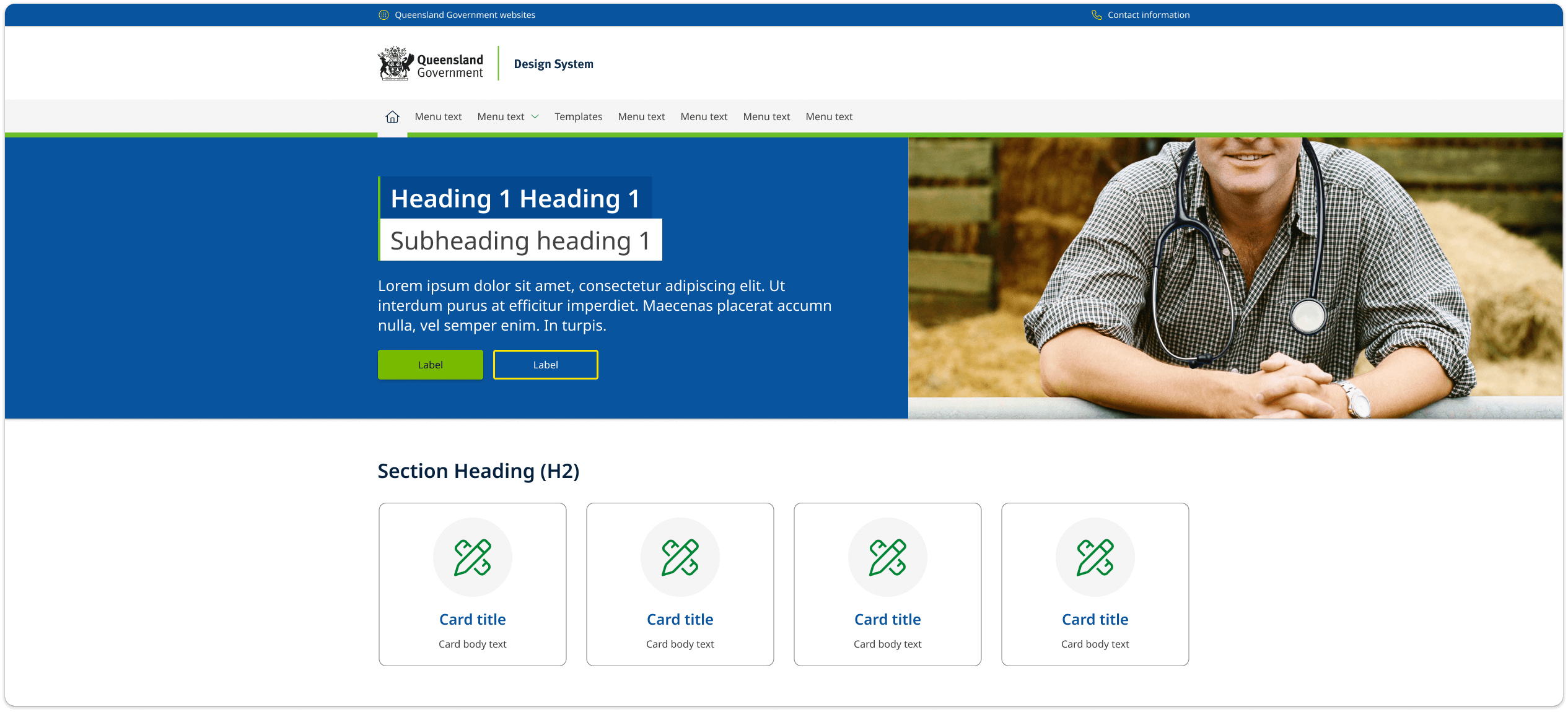
Below is an example of a default banner at 1920px wide. At extra large viewports some images set within banners can become cropped removing key details. This can often be resolved by alerting the image but sometimes when imagery is provided by external sources this is not always possible.
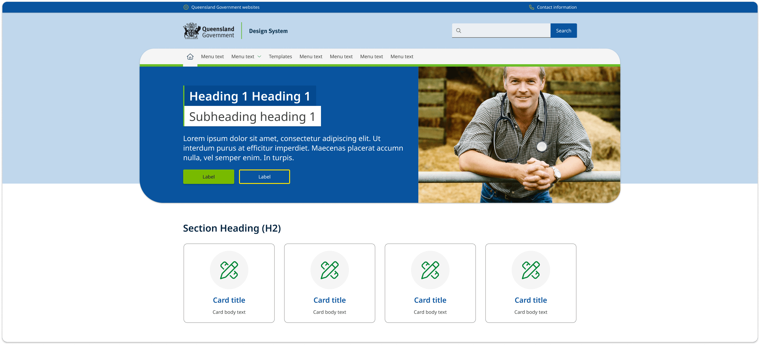
What happens when its applied
In the example below you can see layout changes that occur when the contained banner style is applied.
- The width of the banner is constrained to 1600px so that the hero image is no longer cropped and appears correctly.
- Curved edges and drop-shadows are applied to make the design more harmonious with he layout of the page and other component.
- A solid background colour has been set to fill the negative screen space created by banners smaller width. Background images, or textures can also be applied in the background as alternatives to a solid colour.
The contained banner style is applied globally across a whole site and is not intended to be used on stand alone pages. It only appears on screen sizes above 1600px and is incompatible with vertical navigation layouts.
The contained is applied globally to a site by adding a modifying class qld__banner_contained to the <body> element.
Find our more about the contained banner style by viewing our Figma file.
You can view an example of the contained banner on the Queensland Health Careers website.
General usage guidelines
How to use
Do
Keep it simple
A banner should be easy to understand and not cluttered. Avoid too much text, too many images, and too many colours. Keep it simple and visually appealing.
Keep it brief
The hero banner should be short and to the point. Avoid long paragraphs of text. Headings should ideal be 20-30 characters or fewer and not more than 60 characters. Abstract text should be no more than 160 characters.
Use high-quality images
The banner is often the first thing that people see when they arrive at your website, so it's important to make a good first impression. Use high-quality images that are relevant to your brand and message. Make sure you test your images and that they work correctly at each screen size. Follow our guidelines for hero images to ensure faces and people aren't cropped out unnecessarily.
Use relevant images
Use images of people who are clearly related to the content instead of using models or generic stock photos. People are naturally attracted to pictures, so it's important to avoid using irrelevant graphics that might distract users from important information.
Keep the design consistent
The banner should be consistent with the rest of your website's design. Colour and patterns should be used in meaningful way across the site. Pages that offer similar content should have banner patterns that are consistent and help orientate the user. More complex pages should often use larger banners and simpler pages should use basic banners.
Don't
Use too many calls-to-action
Avoid including too many calls-to-action in your banner. Having multiple calls-to-action can be confusing and overwhelming for the reader. Instead, focus on one primary call-to-action that is clear and easy to understand.
Use vague or unclear messaging
Ensure that your message is specific and clearly communicates the value your site or the service provides. For abstract text make sure they're free of jargon and provide a clear description of the pages. For the home page banner make sure it provides a clear description of your sites primary purpose.
On the home page
Focus on your unique value proposition
Home page banners should highlight your unique value proposition and what sets your brand apart from competitors. Use messaging and imagery that effectively communicates your brand's value and what visitors can expect from your products or services.