
Overview
The Details component lets users show and hide extra information on demand.
Help with marital status
- A de facto relationship involves two people, of the same or opposite sex, who are not legally married, not related, and live together as a couple.
- If in a de facto relationship without a registered marriage, choose ‘Never married’.
- For individuals under 15, select ‘Never married’.
- If divorced or widowed, and remarried, select ‘Married’.
- If divorced and not remarried, select ‘Divorced’, even if in a de facto relationship.
- ‘Separated but not divorced’ means separation from a registered marriage.
- ‘Married’ includes registered marriages and traditional Aboriginal and Torres Strait Islander marriages.
                <!-- Queensland Government Design System: Details component -->

<details id="details-component-1" class="qld__details qld__details--md">
    <summary class="qld__details__summary">
        <span class="qld__details__summary-text">
            <svg class="qld__icon qld__details__icon" aria-hidden="true" xmlns="http://www.w3.org/2000/svg">
                <use
                    href="https://www.designsystem.qld.gov.au/__data/assets/git_bridge/0027/169317/dist/mysource_files/img/QLD-icons.svg#chevron-right"
                ></use>
            </svg>
            Help with marital status
        </span>
    </summary>

    <!-- Content revealed when the details component is expanded -->
    <div class="qld__details__content">
        <ul>
            <li>
                A de facto relationship involves two people, of the same or
                opposite sex, who are not legally married, not related, and
                live together as a couple.
            </li>
            <li>
                If in a de facto relationship without a registered marriage,
                choose ‘Never married’.
            </li>
            <li>
                For individuals under 15, select ‘Never married’.
            </li>
            <li>
                If divorced or widowed, and remarried, select ‘Married’.
            </li>
            <li>
                If divorced and not remarried, select ‘Divorced’, even if in
                a de facto relationship.
            </li>
            <li>
                ‘Separated but not divorced’ means separation from a
                registered marriage.
            </li>
            <li>
                ‘Married’ includes registered marriages and traditional
                Aboriginal and Torres Strait Islander marriages.
            </li>
        </ul>
    </div>
</details>
Usage guidelines
When to use it
- If content is supplementary and only relevant to a subset of users on the page.
- If static inline help text, definitions, or explanatory notes would disrupt the reading flow.
- If only a single item needs to be disclosed (not a related group of sections).
- If you want to give users agency over whether they see additional context, without removing it from the page entirely.
When not to use it
- If most users are likely to need the content; display it in full instead, as hiding critical information increases cognitive effort (Loranger 2014).
- If you have multiple related sections to show and hide, use the Accordion group component instead, which is designed for grouped disclosure.
- If the content is a primary action or step in a task (do not hide required information behind a disclosure toggle).
- If the content is so short it can be included inline without disrupting the page (a single sentence does not warrant a disclosure widget).
- If you need to disclose content as part of a form (consider whether a well-written label or hint text is more appropriate).
How to use
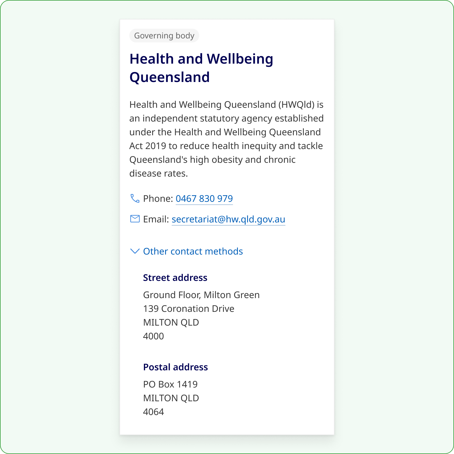
Do
Use Details to display additional information that is less frequently needed so users can decide what to see.
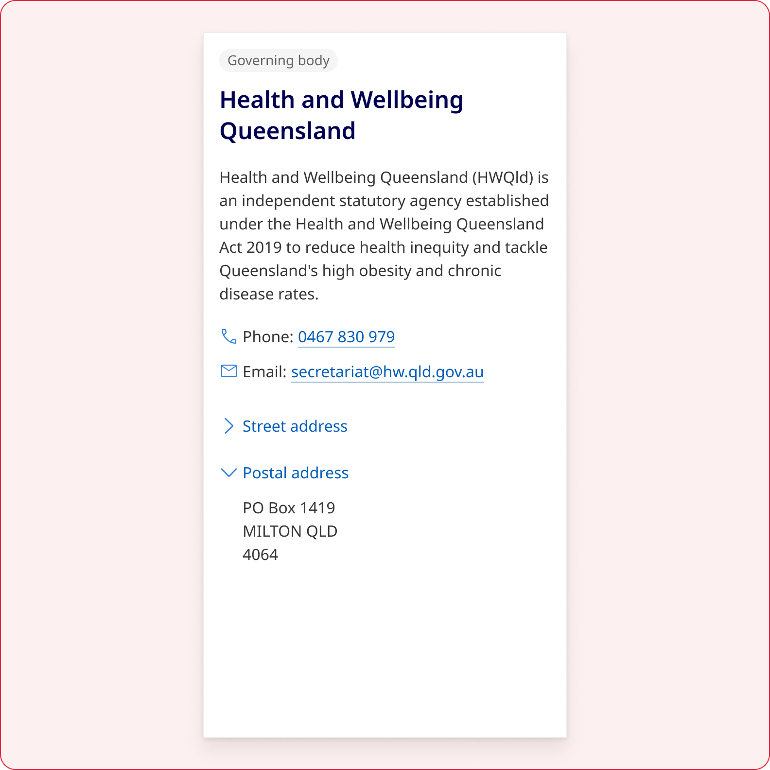
Don't
Don't use multiple Details components to group related information into stacked sections. Instead use Accordion.
Write clear labels
The <summary> label is the only visible text when the component is collapsed, so it carries the full responsibility of helping users decide whether to open the panel.
- Describe the content directly, for example, "Eligibility criteria" rather than "Find out if you are eligible".
- Use nouns rather than gerunds where possible.
- Stay under 10 words unless a longer phrase is genuinely needed for clarity.
- Avoid verbs like, 'Show' and 'See' as they describe the action of the component and become inaccurate once opened, producing contradictions for both sighted users and screen readers.
- Avoid filler words like, 'More' to reduce repetitiveness and improve the ability to quickly scan content.
- Avoid ending in a full stop.
Write succinct content
- The content inside the panel should be self-contained: it must make sense on its own without requiring the user to read surrounding page content first.
- Keep panel content concise, if it runs longer than a few short paragraphs, consider whether the information belongs on a separate page or within the main body of the page.
Choose a colour palette for the context
The Details component adapts to all five QGDS section colour palettes. Always match the component palette to the surface it sits on, do not place a Default variant on a Dark alternate section, for example, as this breaks the visual consistency of the section.
Adjust the size for content sections
Choose size based on surrounding elements and appropriate information hierarchy.
| Size | Font size | Forms | Content | Use |
|---|---|---|---|---|
| Small (SM) Default | 0.875rem / 14px | Suitable for most content contexts and all form contexts | ||
| Medium (MD) | 1rem / 16px | Use when the component sits alongside body text at base size | ||
| Large (LG) | 1.25rem / 20px | Use when a more prominent disclosure trigger is needed | ||
| Extra Large (XL) | 1.5rem / 24px | Use sparingly for high-prominence disclosure in editorial or landing pages |
Details versus Accordion
Although both Details and Accordion are similar in nature, there is a difference between the components.
| Details | Accordion | |
|---|---|---|
| Visual example | 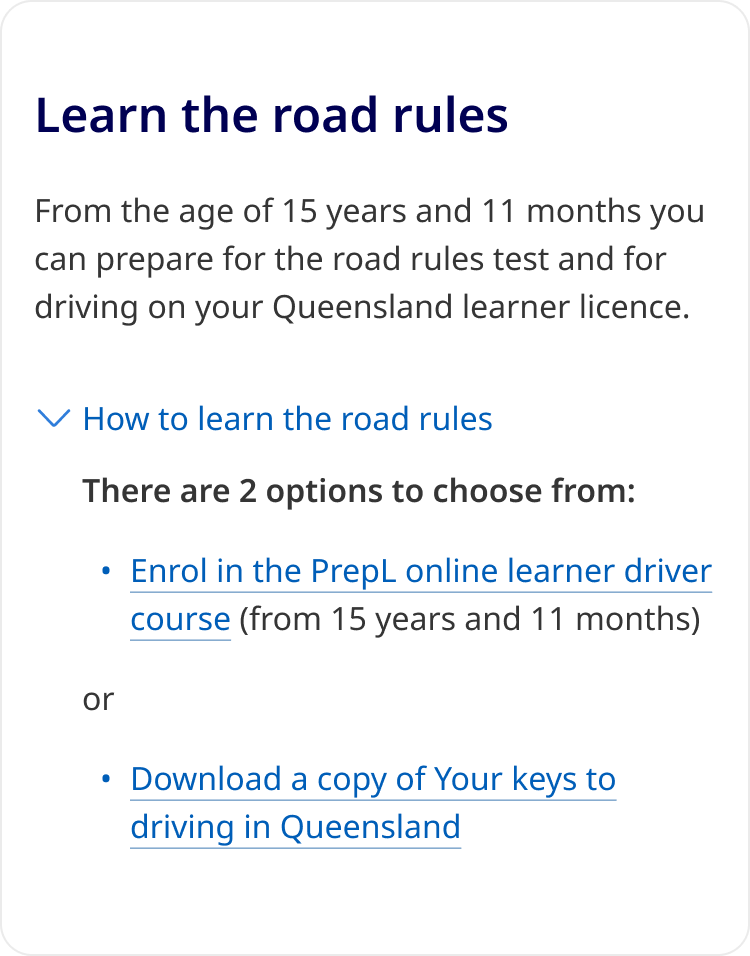
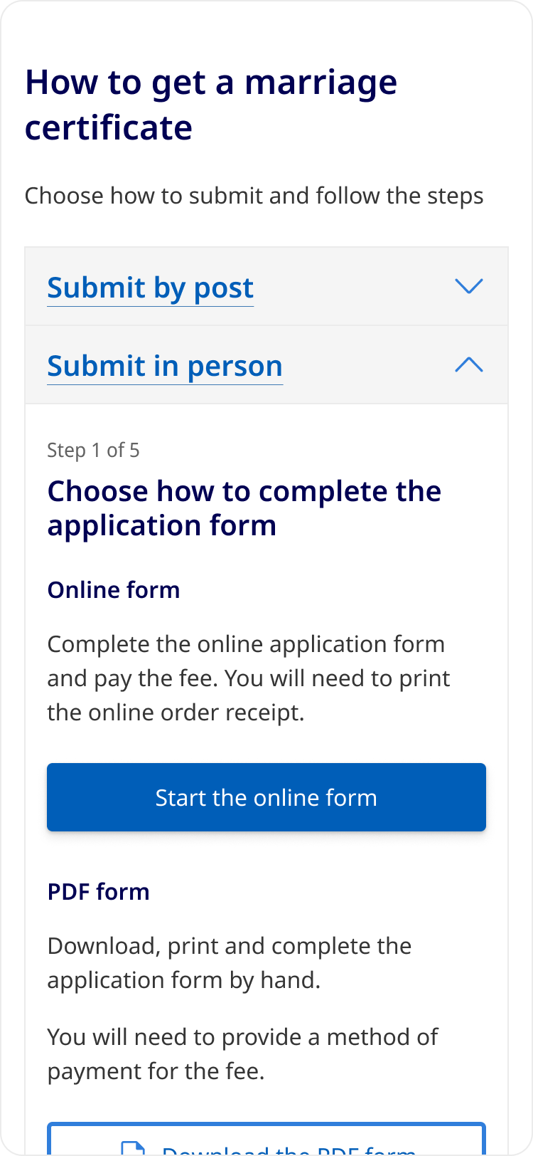
| 
|
| Structure | An interactive label that can be toggled to show or hide content. |
A vertical stack of contained headings that can be toggled to show or hide content. A stack of 3 or more can include an optional Open/Close all button to toggle all sections at once. |
| Use case | For additional content that is optional or less frequently needed. Often used in forms, descriptions and definitions. | For displaying a set of related information. Often used to chunk sections of content that are only relevant to some users. |
| Presentation | Subdued to reveal content within a continuous flow (part of the content). | Prominent and visually segmented with headings for each section. |
| Relationships | Extending content beyond the initial presentation (like a form input). | Suitable for grouped information. |
| Icon placement | Left | Right |
| Icon treatment |
chevron-right (collapsed) chevron-down (expanded) |
chevron-down (collapsed) chevron-up (expanded) |
Design research and rationale
Grounded in cross-industry design system precedent
The QGDS Details component is based on the GOV.UK Design System Details component, which has been tested with real government service users and is built on the same native <details> and <summary> HTML elements. Gov.UK's research established that the pattern is well understood by users when the summary label is clear and descriptive.
Beyond Gov.UK, the component draws on progressive disclosure patterns from three major commercial design systems, each of which independently validated the same core pattern across different product contexts:
- GitHub Primer established progressive disclosure as a first-class interaction pattern with clear guiding principles, including pairing disclosure controls with descriptive text and avoiding interactions that disorient the user's initial point of focus. The Primer Details component is a styled wrapper that enhances the native
<details>element with a button-driven summary trigger, demonstrating how the native pattern can be extended for production use in a design system at scale. - AWS Cloudscape Expandable Section demonstrates the pattern's suitability in complex, information-dense enterprise interfaces where progressive disclosure reduces cognitive load without sacrificing access to detail.
- Salesforce Lightning Design System Summary Detail shows a comparable disclosure pattern applied inside dense data contexts, validating the trigger-and-panel model as intuitive to a broad range of users.
The convergence of this pattern across government, developer tooling, cloud infrastructure, and CRM contexts gives confidence that the Details component addresses a genuine, widely understood user need.
Distinct from the Accordion component
The Details component and Accordion serve different purposes and should not be used interchangeably. The Accordion is designed for groups of related content sections and includes "Open all" / "Close all" controls for groups of two or more panels. The Details component is for a single standalone disclosure, for example, a definition, a description, or a help note adjacent to a form field.
Using a single Accordion panel where a Details component is appropriate adds unnecessary visual weight and interactive complexity to a page.
Chevron icon
Chevrons are used rather than plus/minus icons or triangles, consistent with the Accordion component. Plus and minus carry additive and subtractive connotations in form contexts, which creates ambiguity when used as a disclosure toggle (Laubheimer and Budiu 2020). The chevron is also consistent with other QGDS interactive controls that reveal additional content or options, including the Select component and the Accordion. This consistency across components creates a unified visual language where a chevron signals "more is available."

While the Details component shares the chevron icon with the Accordion, it differs in both position and default direction.
The Accordion places the chevron at the far right of a full-width bordered trigger row. That container makes the interactive area self-evident, so the icon can sit at a distance from the label. The Details component has no equivalent container, without a border or background to define an interactive region, a right-aligned chevron loses its visual relationship to the label, especially at wider viewports.
Placing the chevron to the left of the summary label keeps the icon-plus-label unit visually cohesive and reads as a single interactive control. This positioning also aligns the icon with the leading edge of QGDS validation message text, reinforcing the component's visual relationship to adjacent form elements when used in an input group.
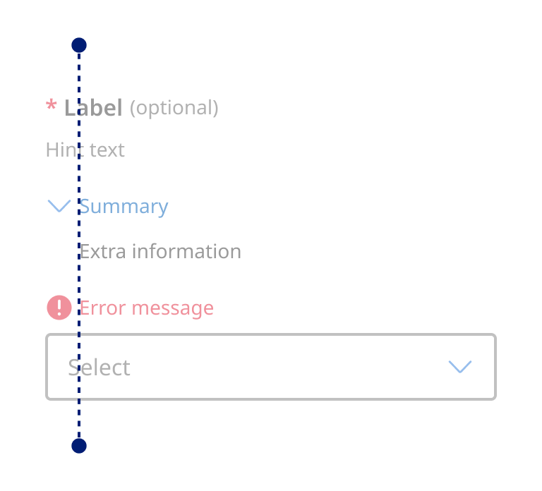
The chevron points to the right in the collapsed state and rotates downward when the panel opens (the inverse of the Accordion). This matches the convention used by Gov.UK, GitHub Primer, AWS Cloudscape, and Salesforce Lightning in their disclosure components, and better suits a left-positioned icon: a right-facing chevron points toward the label and the content it controls, while a downward-facing chevron in the left position risks being read as pointing to the content below rather than indicating the collapsed state.
States
The interactive states of the Details component: default, hover, focus, and expanded, were designed to be consistent with other QGDS components that follow a trigger/disclosure model, including buttons, tabs, and accordions. Users who are familiar with how these components behave can transfer that understanding to the Details component without relearning.
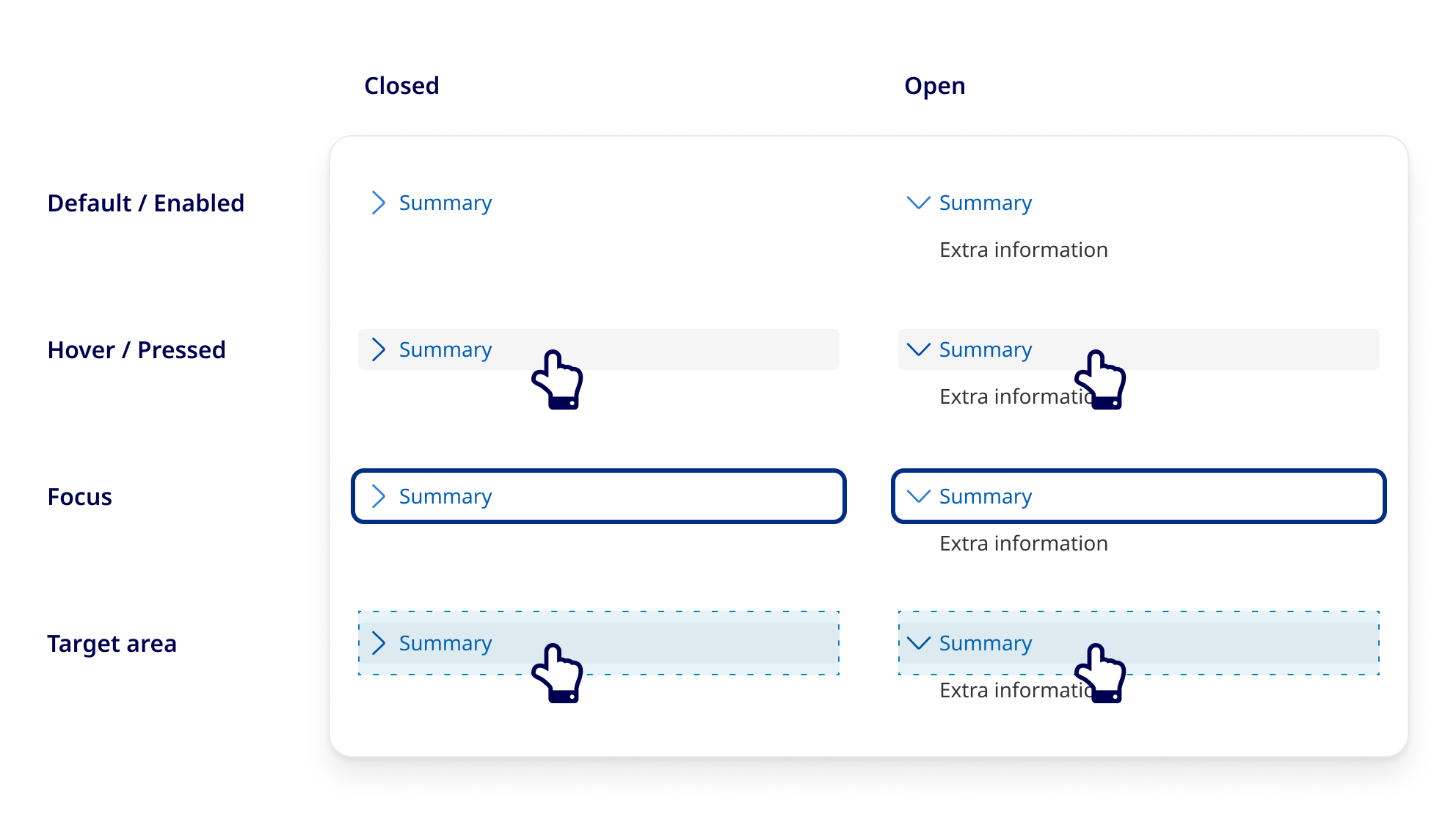
While using the link style underline was considered in earlier iterations of the Details component, research from GOV.UK found evidence the behaviour of a Details component could be misconstrued when styled like a link, so we opted to use a background colour for visual state changes instead. During usability testing, we found no adverse affects of removing the underline link style and relying solely on the icon and colour (for sighted users) as interactive cues.
Each state uses the same visual tokens (colour, border, focus ring) as its functional equivalents in other components. This approach reduces the design system's surface area for visual decision-making and ensures components behave predictably as a system rather than as isolated widgets.
Placement within a form
When the Details component is used inside a form, for example, to provide additional context for a specific field, the position of the component within the input group was considered carefully. The question was whether it made more sense to place the Details component before or after the associated input control.
The decision to place Details after the hint text and before the input control reflects how users typically read a form field: label first, then any clarifying hint text, then any additional information they need before committing an answer, then the input itself. Placing Details after hint text but before the input means users encounter supplementary information at the moment in the reading sequence when they are most likely to need it, before they begin entering data, not after.
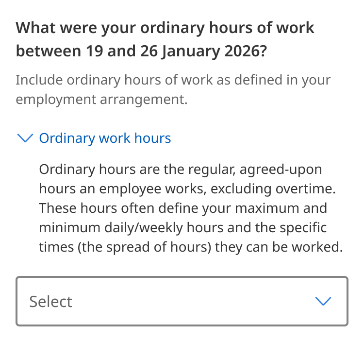
This ordering is also validated by accessibility requirements. WCAG 1.3.2 Meaningful Sequence (A) requires that when the order of content affects its meaning, that order is reflected in the DOM and not produced artificially through CSS or JavaScript. Placing the Details component in its logical visual position in the DOM, rather than reordering it programmatically for screen reader users, ensures that both sighted and non-sighted users encounter the same information in the same sequence (W3C 2023).
Implementation
The Details component uses the native <details> and <summary> HTML elements, which have built-in accessibility support in all modern browsers. The guidance below applies when the component is customised, when native browser behaviour is overridden with JavaScript, or when consuming teams implement a visually similar pattern using non-native elements.
ARIA attributes
The native <details> and <summary> elements do not require additional ARIA attributes to function accessibly, browsers handle role and state exposure automatically. The following ARIA guidance applies when the native implementation is extended or replaced.
If you recreate this pattern with non-native elements:
- Apply
role="button"or use a<button>element as the trigger - Apply
aria-expanded= "true|false"on the trigger to reflect panel state - Apply
aria-controls="[panel-id]"on the tirgger, referencing the panel - Apply
idto the panel element matching thearia-controlsvalue - Apply
aria-labelledby="[trigger-id]"on the panel to assosciate it with its trigger.
Keyboard interactions
| Key | Action |
|---|---|
| Tab |
Moves focus to the <summary> trigger, then to any focusable elements inside the open panel, then to the next focusable element on the page
|
| Shift + Tab | Moves focus to the previous focusable element |
| Enter |
Toggles the panel open or closed when the <summary> is focused
|
| Space |
Toggles the panel open or closed when the <summary> is focused |
Accessibility
Any QGDS Details component should pass these WCAG 2.2 guidelines.
Test the Details component in your space
QGDS completes tests on all components to meet accessibility requirements. While QGDS provides accessible components by default, we recommend the Details component is also tested within the tested of your own project or product to ensure an accessible experience.
Perceivable
The disclosed content must be programmatically associated with its trigger so assistive technologies can communicate the relationship to users.
Summary label or trigger has an accessible name
The <summary> element provides the accessible name for the <details> element. Do not replace <summary> with a generic <div> or <span> , this breaks the programmatic association between the trigger and the panel.
WCAG 2.2: 1.3.1 Info and Relationships (A)
Text meets 4.5:1 and icons meet 3:1 against the background
The <summary> label text and <details> content text must meet a minimum contrast ratio of 4.5:1 against its background in both the light and dark variants. The chevron icon used as a state indicator must also meet a 3:1 contrast ratio against its adjacent colours.
WCAG 2.2: 1.4.3 Contrast Minimum (AA)
Operable
Details panel toggles with keyboard interaction
The <summary> element is natively keyboard focusable and responds to Enter and Space. If you override the default browser behaviour with a custom JavaScript toggle, you must preserve keyboard operability, including focus management when the panel opens and closes.
Focus stays on the summary label on toggle
When the panel opens, focus must remain on the <summary> trigger. Do not move focus automatically into the panel content on expand, as this can disorient keyboard and screen reader users.
WCAG 2.2: 2.4.3 Focus Order (A)
Focus indicator is visible
The focused <summary> element must display a visible focus indicator. This criterion requires that a focus indicator exists and is visible, it does not specify minimum size or contrast. See 2.4.12 and 2.4.13 below for the stronger WCAG 2.2 requirements that govern focus indicator quality.
WCAG 2.2: 2.4.7 Focus Visible (AA)
Focused trigger is not covered or hidden
When the <summary> trigger receives keyboard focus, no part of it must be hidden behind other author-created content, for example, a sticky header or a floating banner. QGDS recommends meeting this enhanced standard to ensure the focused trigger is fully visible at all times during keyboard navigation.
WCAG 2.2: 2.4.12 Focus Not Obscured (Enhanced) (AAA)
Focus indicator meets contrast 3:1
The visible focus indicator on the <summary> trigger must meet minimum size and contrast requirements when rendered by the author. The indicator area must be at least as large as a 2px thick perimeter around the component, and must provide a contrast ratio of at least 3:1 between the focused and unfocused states.
WCAG 2.2: 2.4.13 Focus Appearance (AAA)
Target area is a minimum of 44 x 44px
The interactive area of the <summary> trigger must meet a minimum target size of 44 x 44 CSS pixels. QGDS recommends meeting this standard to ensure the trigger is comfortably operable for users with motor impairments or imprecise pointer input. The QGDS implementation meets this requirement by default. If you modify the component's padding or height, verify that the touch target size is preserved.
WCAG 2.2: 2.5.8 Target Size (Enhanced) (AAA)
Understandable
Details panel does not toggle on focus, hover or page scroll
The panel must only expand or collapse in response to an explicit user action on the <summary> trigger. Do not auto-expand the panel based on page scroll, focus alone, or other automatic conditions.
Robust
Assistive technology correctly reads toggle state
The native <details> element exposes a disclosure role to assistive technologies automatically. The open attribute reflects the expanded state. If you recreate this pattern using non-native elements, you must apply role="group" or role="region" and manage aria-expanded on the trigger manually.