
Overview
Overview
Allow users to select one or more files to upload to a specific location.
This component is best suited to situations where multiple files are being uploaded. There are 2 ways to upload – via drag and drop or file selection via search.
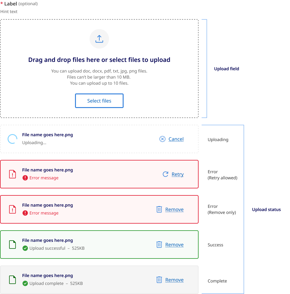
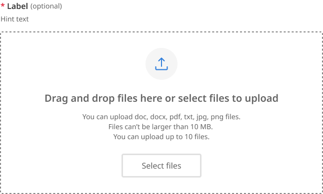
The component is comprised of two main parts, the 'upload field' and the 'upload status'.
Upload field behaviour
The upload field comprises a drag and drop region, a select files button, an upload icon, form label and hint text, an upload heading, and a file upload description.
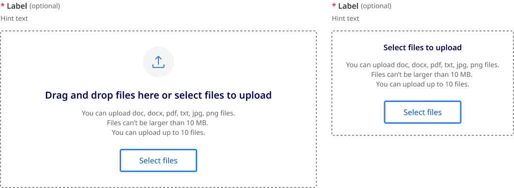
Desktop and mobile
The upload field on desktop has a larger area to make drag and drop functionality easier.
On mobile since it is uncommon to use drag and drop functionality the heading changes to only state “Select files to upload”.
The feature icon is also removed to save vertical space.
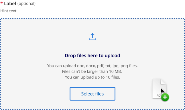
Drag and drop
This state will appear when a file (or files) are dragged from outside the browser window over the target area.
When dragging a file into the drop zone region the text changes to say “Drop file here to upload” the background also changes and the outline darkens. The design of this state mirrors what happens on other form fields during hover states.
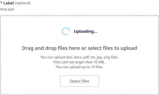
Disabled while uploading
If your environment does not support a user uploading additional files while others are still in the progress of being uploaded. The upload field will change to a disabled state until all active files have been processed.
When this state is active the upload icon is replaced with a loading spinner.
This is state may or may not be used depending on your implementation.
Disabled
This is the standard disabled state for file upload field.
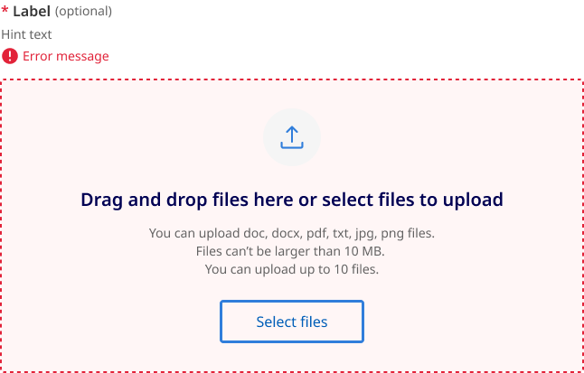
Error
This is error state for the overall input field. It is based on invalid state for standard form fields.
File upload status
There are three groups of file upload status:
- loading
- uploaded and
- error.
Loading status
The example below shows the files loading state of a file while it is being uploaded. This state will appear while a file is being uploaded. Once complete, it will validate the upload against the supplied parameters and transition to either an uploaded or error state.

If file removal is not instantaneous then the landing state can also be used to indicated that a file is being removed form the list. In this situation the text changes to ‘Deleting...’
Uploaded status
An uploaded file will appear as shown below. Users have the option to remove uploaded files.
There are to types of validation for uploaded file:
- Upload complete
- Upload successful
Upload complete
Upload complete i is used for client side validation that the file has been uploaded and is ready to be submitted. This state is used when is not actually stored yet in the file hosting service but has passed validation.

If your file upload implementation validates and stores the file directly into the file hosting service before the form is submitted your will not require the upload complete status shown above, instead the file should use the upload successful status below.
Upload successful
Upload valid is a secondary validation state used indicate the file has been successfully stored or submitted.

Error status
When a specific file cannot be uploaded successfully it will show an error state.
There are two types of error messages based on the accompanying action:
- retry upload
- remove upload
Error retry upload
This is given when a document upload has failed due to a network connection issue, sever error, glitch or timeout.
When the retry button is pressed the file will attempt to upload again.

Error remove upload
Retry is disabled and replaced with remove for the following errors:
- File size limit exceeded
- File type not supported
- File name already exists
- File count exceeded
- Filename contains invalid characters.
- File did not pass virus scan

Usage guidelines
When to use
- You should only ask users to upload something if it’s critical to the delivery of your service (GOV.UK, n.d.).
- When a user needs to upload one or more files (Siemens, 2024).
When not to use
When documents are optional. Avoid asking users to provide documents if you don't require them (Digital NSW, n.d.).
How to use
Do
- Upload selected files instantly as they are selected or on submission (Digital NSW, n.d.).
- Be considerate of asking for large files, as some users may have limited band width or data (Digital NSW, n.d.).
- specify accepted file types, maximum file size and whether the user can upload one file at a time or several at once (DAFF, 2024).
- Include hint text to provide more general information about the field/file (DAFF, 2024).
- Indicate file uploading state (DAFF, 2024).
- Indicate a successful file upload using a Page alert, including file name (DAFF, 2024).
- Indicate unsuccessful file uploads using a Page alert with a meaningful error message, solution and support contact (DAFF, 2024).
- Allow multiple file formats as not everyone has access to the same software )US Government, 2022).
- Once a user uploads something, automatically check it for errors (Shopify, n.d.).
- Make use of the ‘instant upload’ pattern if your backend supports it (DAFF, 2024).
- Truncate file names when they extend beyond the width of the parent element (Digital NSW, n.d.).
Do not
- Add a secondary submit file button inside a form for the upload component (DAFF, 2024).
- Use in modals or page alerts (DAFF, 2024).
- Skip file validation checks can result in issues such as uploading files of incorrect formats or sizes, leading to potential errors down the line (OWASP, 2024).
- Ignore security concerns File uploads can pose security risks if not properly handled. Take measures to prevent potential security vulnerabilities, such as implementing file type validation to prevent malicious uploads and ensuring secure storage of uploaded files (OWASP, 2024).