Design
Research and rationale
Our spacing system was developed by using the spacing and grid system is based on the one created by Digital Transformation Agency's Design System. We broke down all the spacing values, expanded these to work across our new components and developed more specific guidelines for how this spacing would apply to UI elements on a page.
Most of the spacing values we used were the defaults that were inherent in the DTA Design System however they were just not exposed in a way that made it easy for users to see as whole or how they should be applied across a whole page layout.
We referred to our spacing guidelines as our vertical rhythm.
We found that the advantage of having a method like this to define spacing is that it allows designers and developers to speak a common language and lessons the risk of inconsistency when designing new components or patterns. It makes design scalable, simplifies the decision making process for designers and creates more visual harmony across our page layouts
Consistency and visual hierarchy
The spacing values are based on a modular scale, which helps create a consistent vertical rhythm. Consistent spacing enhances the visual hierarchy, which in turn improves the readability and scan-ability of the content. A List Apart has a detailed article on modular scales and meaningful typography.
Accommodating user preferences
By using rem units, the design can adjust to the user's browser font-size settings. This is also especially useful for creating responsive designs that adapt to different screen sizes and resolutions, accessibility and user preferences.
Harmonious design with 8-point grid system
The use of 8px increments is part of the widely adopted 8-point grid system. This grid is popular because it provides a simple, flexible way to size and align elements, and it works well with various screen sizes. Google's material design also uses an 8dp grid system.
Improved legibility and content grouping
With proper spacing, you allow for elements to be grouped or separated logically. This is important for the Gestalt principles where the human eye seeks to find order and can group elements based on proximity. Nielsen Norman Group’s article on proximity as a Gestalt principle explains this in detail.
Focus and attention
Adequate spacing, especially around headings and between sections, helps guide the user's focus and attention. It makes it easier to distinguish different sections and comprehend the structure of the page.
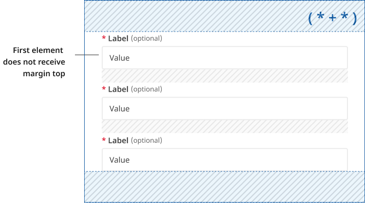
Lobotomised owl ( * + * )
We use a technique called lobotomised owl ( * + * ) to add spacing above components. This only occurs when the component follows another element. This allows us to apply a consistent spacing throughout the page.
If an element is the first child or doesn't follow an element it won't receive a margin-top.